How to Design a Golf Outing Polo
A golf outing logo on a polo is a small, precise design problem. The wrong placement or a file that was not built for fabric will look unprofessional in every photo from the day.
Placement: Left Chest Is Standard, Right Chest Is a Statement
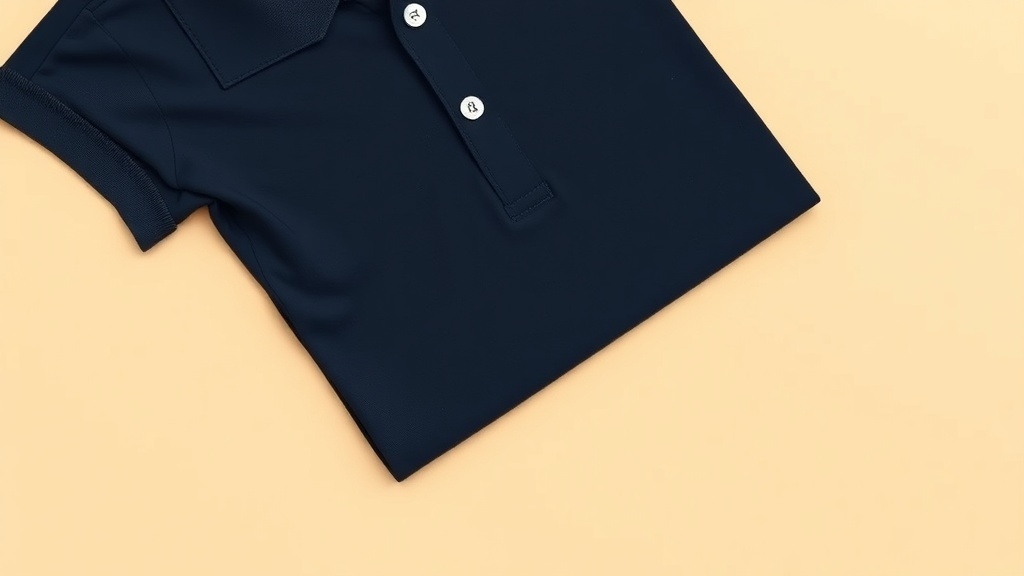
The left chest is the default for golf outing polos, positioned three to four inches below the collar seam on the left side. This placement reads as professional and restrained, which is appropriate for a charity golf day or a corporate outing.
A right chest placement is unusual enough to stand out on the course and works well if the logo has strong visual equity and you want it to be noticed. Avoid splitting a primary logo across both chest areas. It almost never looks intentional.
Size: How Big Is Too Big
For a left chest logo on a polo, 3 to 4 inches wide is the right range. Above 4.5 inches it starts to read like a print tee rather than a uniform. Below 2.5 inches and the detail in a complex logo gets lost.
If the event name is long (for example, a charity name with a subtitle), stack it in two lines and keep the total height under 3.5 inches. A horizontal lockup wider than 4 inches is harder to place cleanly on a polo's chest seam contour.
File Specs That Print Cleanly on a Polo
Submit a PNG with a transparent background at 300 DPI. Vector source files (AI, EPS, SVG) are ideal if your designer can export them. A logo rebuilt from a vector will always look sharper on fabric than one upscaled from a web image.
White elements in the design require explicit white shapes in the file. DTF lays a white base layer automatically, but the software reads your file to know where the white should go. If your logo has white text on a dark polo and the file has a transparent background where the white should be, those elements will not print.
What Makes a Logo Feel Premium on Fabric
Simplicity. A logo that works at small scale, uses two to three colors, and has clear negative space will look intentional and well-executed on a polo. A logo that was designed for a website header with gradients, drop shadows, and fine detail will look busy and blurry at 3.5 inches wide.
If the outing has an existing logo that was not designed for apparel, ask your designer to create an apparel-specific version. That usually means simplifying the shape, increasing stroke weight on thin lines, and confirming color values work on the specific polo color you chose.