
Comfort Colors Colorblast vs 1717 Compared
The Colorblast and 1717 are both Comfort Colors garment-dyed tees but produce visually different results: the Colorblast creates intentional blotchy color variation while the 1717 aims for more even tone, and that difference affects how your DTF print reads on the shirt.
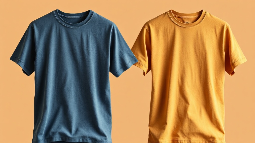
What the Colorblast Is
The Comfort Colors Colorblast is a garment-dyed tee that uses a two-step process to intentionally create blotchy, variegated color across the garment surface. The effect is visible from arm's length: each shirt looks slightly different from others in the same colorway. High-contrast areas can vary by 2-3 shades from light to dark across a single shirt.
The Colorblast is designed for brands that want a heavily distressed, vintage, or artistic aesthetic. It is the choice when the garment itself is meant to read as a design element. It is not the choice when your customer wants consistent, predictable color across a batch.
How the 1717 Differs
The 1717 is also garment-dyed but targets even color distribution. Individual shirts still have the slight tonal variation that characterizes all garment-dyed products, but the 1717 does not intentionally amplify that variation the way the Colorblast does. Across a batch of 1717s, the color is much more consistent shirt to shirt.
The 1717 is the right choice for branded apparel where color consistency across a production run is important, or when the brand wants the garment-dyed aesthetic without the wild variation of the Colorblast.
DTF Print Legibility on Each
On the 1717, DTF prints read cleanly. The even base color provides a predictable background for your design. Contrast is consistent across the print area. This is the standard garment-dyed canvas for most DTF decorator work.
On the Colorblast, DTF prints can read unevenly because the background varies underneath the print. White text on a Colorblast shirt in a medium tone will have some letters over lighter areas and some over darker areas, changing the apparent contrast of the design. This is either a feature or a bug depending on your brand's aesthetic intent.
When to Choose Each
Choose the 1717 when consistent print legibility matters, when you are producing a branded run with specific color expectations, or when the customer is new to garment-dyed blanks and may not expect the variation of the Colorblast.
Choose the Colorblast when the brand aesthetic is explicitly vintage, distressed, or artistic, when the customer wants every shirt to look unique, or when the design is large and abstract enough that background variation becomes part of the final art. It is a specialty blank with a specific use case.